Two of the most common questions we hear are "why does my EG4 chart data spike like that?" and "why does my daily total not match the number I saw a minute ago?" Both come down to one fundamental distinction: the difference between power and energy. Once it clicks, your charts will make a lot more sense.
Power is a speed; energy is a distance
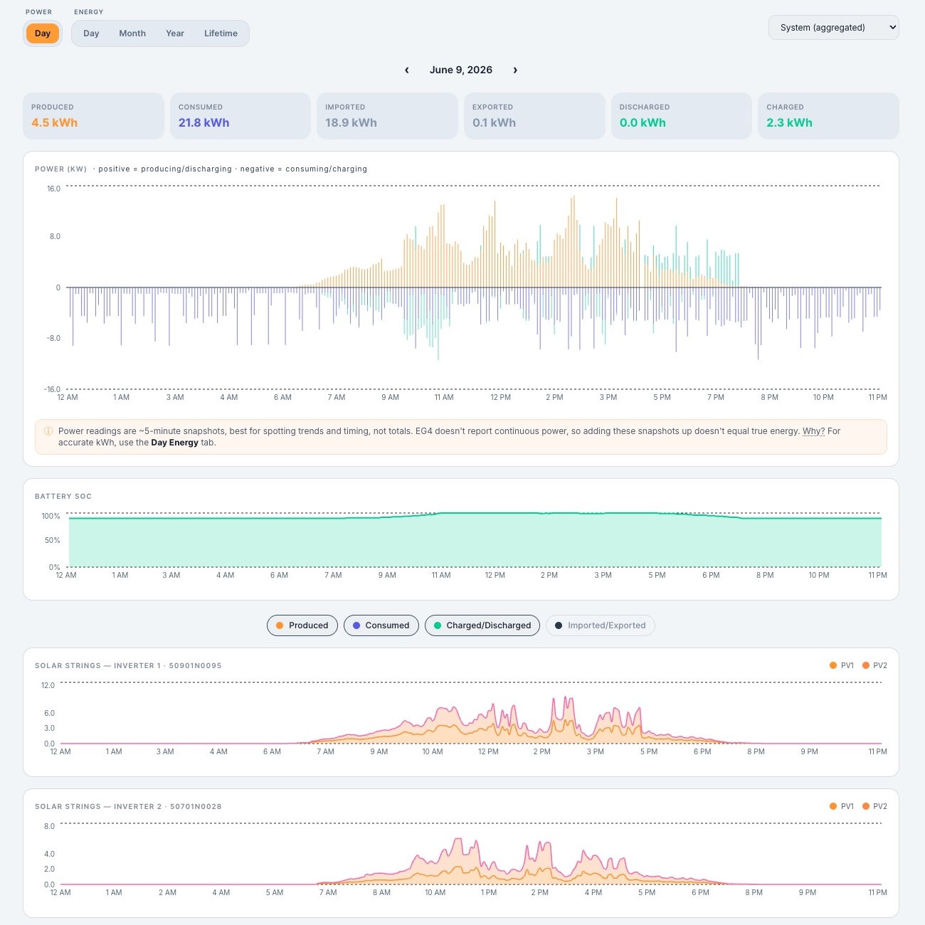
Power, measured in kilowatts (kW), is how fast energy is flowing at a single instant. Think of it like the speedometer in your car. Energy, measured in kilowatt-hours (kWh), is how much has accumulated over time. Think of it like the odometer.
A solar array producing 5 kW for one full hour delivers 5 kWh. The same array producing 5 kW for just 15 minutes delivers only 1.25 kWh. Same power, very different energy, because the amount of time is different. This is the key idea behind every chart in FourScoped.
Power tells you what is happening right now. Energy tells you how much happened over a period.
Why FourScoped shows both
The Day Power chart plots instantaneous power at roughly 4 to 5 minute resolution. That fine detail is what lets you see the exact moment the sun broke through clouds, or when a well pump or air conditioner kicked on and spiked your load. It is a story told in real time.
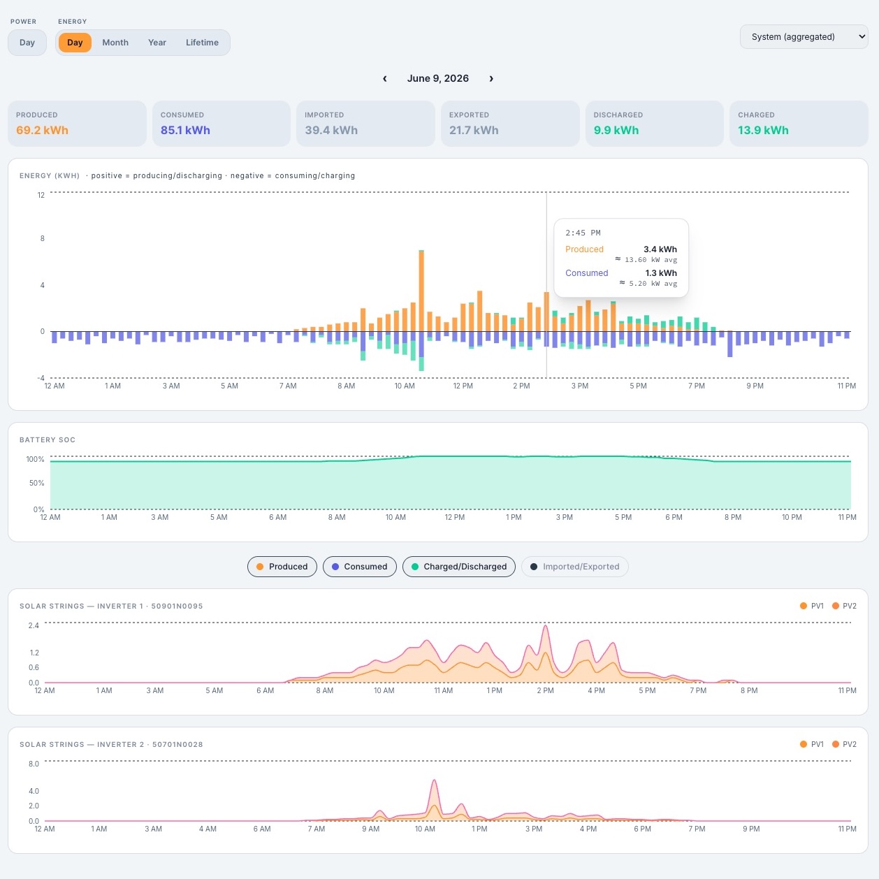
The Day Energy chart shows energy accumulated in 15-minute buckets. That is the correct way to total up production and consumption, because energy is what your utility bills you for and what fills your battery.
Totals that actually reconcile
Here is where many monitoring tools get it wrong. If you try to estimate daily energy by adding up power samples, small timing errors compound and the total drifts away from reality. FourScoped instead derives daily energy from EG4's own cumulative counters, the same source the official EG4 portal uses. The result: the totals on your Day view match what you see in the Month view for that same day, every time. No double counting, no mysterious drift.
One more guard against confusion
Because the Day Energy chart uses 15-minute buckets, a single bar might read 1.2 kWh. That is energy for a quarter hour, not per hour, and it is easy to misread. So when you hover a bucket, we also show the average power for that interval. A 1.2 kWh quarter-hour bucket, for example, is about 4.8 kW of average power. Small touches like that keep the numbers honest and your interpretation correct.
Understanding power versus energy is the single most useful concept for reading any solar dashboard. Master it once, and every chart you ever look at gets easier.